A burndown chart is a graphical representation of how much of work is left to do on the backlog versus the amount of time. Time is shown on the horizontal axis and work remaining on the vertical axis. They are useful for predicting when all of the work will be completed.
As time progresses and items are drawn from the backlog and completed, a plot line showing work remaining may be expected to fall. The amount of work may be assessed in any of several ways such as user story points or task hours. Work remaining in sprint backlogs and Product backlogs may be communicated by means of burn-down chart
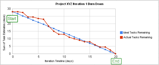
They can be used for performance measure just by comparing how the line from the ideal tasks remaining and the actual tasks remaining behave: - If the actual work line is above* the ideal work line → there is more work left than originally predicted and the project is behind schedule - If the actual work line is bellow the work line → the is less work left than originally predicted and the project is ahead of the schedule
The precision of a burn down chart is very dependent on how precise is the time estimation for the backlog. If the team don’t have a good time estimation the burn down chart can’t be precise